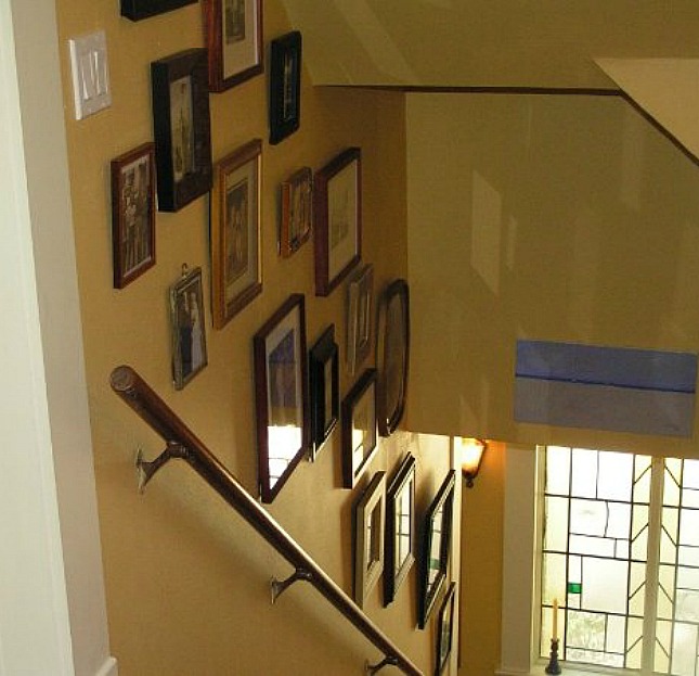
In our Dallas house, we filled our entire stairwell space with a wall display of black and white family photos. It worked well in a space that would have otherwise been boring and blank.
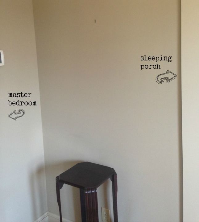
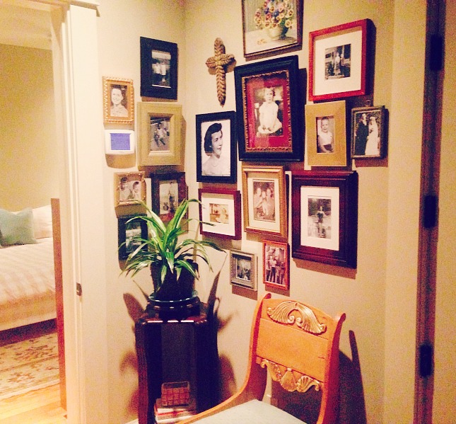
Instead, we chose an empty corner just outside our bedroom.
First off, this is not a post about how to measure so that you end up with flawlessly positioned frames. There are tons of pictures on Pinterest about templates and measuring if you are a stickler for perfectly aligned pictures. I’m just not that worried about it. Ask my husband…I think I make him nervous with my free-spirited hammering.
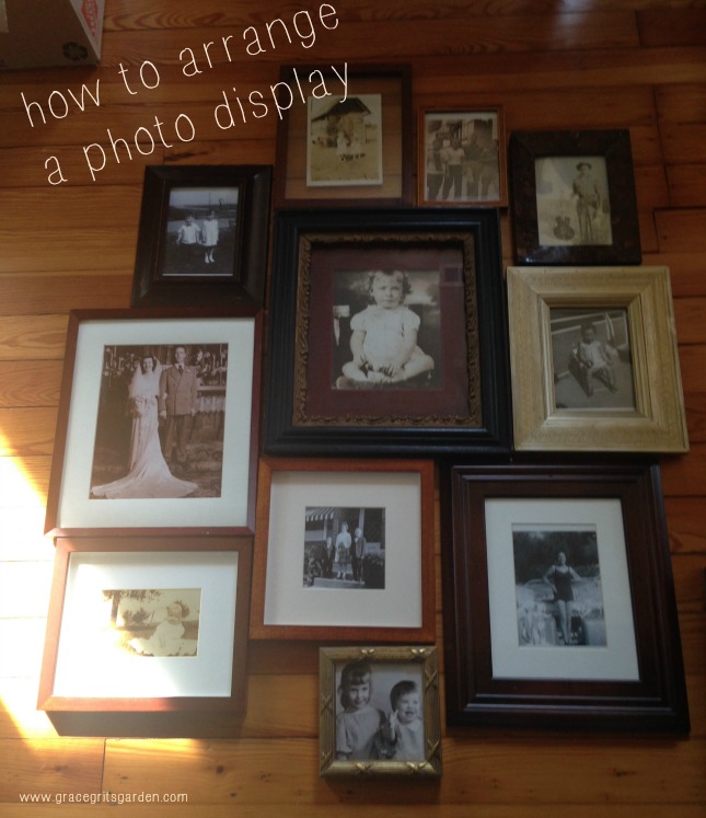
Unless we are hanging a heavy piece of artwork that involves screws and toggle bolts, I do minimal measuring and try not to sweat it. The only real “prep” I do is placing photos on the floor to roughly decide an arrangement. And the arrangement never ends up the way it starts. Even so, I do have a few tips that work for me.
1.) Pick a prominent frame/photo to serve as the focal point.
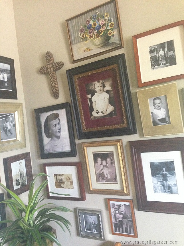
2) Locate the center of your space (sometimes I measure this). Once I hang the focal point photo, I typically abandon my first arrangement and begin holding up various photos until I find the next one that speaks to me. (You can use Command Strips if you are worried about nail holes, but I use picture hangers.)
3.) Hang photos 1-2 inches apart for a stylish, modern look that doesn’t seem contrived. I like to think of my style as Elle Decor meets Billy Reid, a bit eclectic yet not too over the top.
4.) After hanging a few of the center photos, live with the look for a few hours before adjusting or adding more. If something is off, you will notice. If you have a large collection of framed photos like I do, usually switching out the picture with a different sized frame will rebalance the look (rather than making another nail hole).
5.) Keep frames and photos in the same color family. They don’t have to be identical in shape, color, material, but they should complement each other. I used different color wood, antique frames, black and white and sepia toned photos.
6). Break the look up with something different to add interest. I hung a wooden cross and small vintage oil painting.
7.) Wrap the wall with photos to make an impact in a small space.
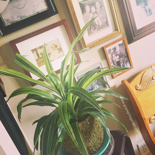
The plant in the corner softens the whole look plus adding something alive always makes me happy. (SaraBeth if you are reading this, your plant is doing well!)
This look may not be for everyone, but after stressing about it (and calling in my sister-in-law for her opinion), I’m enjoying the final result. Plus I love having our family members together in one place.
Now, you know those photos you’ve been meaning to hang forever? Get to it.
Grace Grits and Gardening
Farm. Food. Garden. Life.
“A photograph shouldn’t be just a picture, it should be a philosophy.”
― Amit Kalantri
Musical Pairing:
Paul Simon, Kodachrome
